

25
abril
2026
Desenvolupament web i SEO a Barcelona. Sol·licita consulta


Basat en valoracions de clients satisfets.
Els nostres serveis estan personalitzats per al teu negoci.
Amb un portfoli de projectes d'èxit i clients satisfets, tenim una sòlida reputació a Barcelona.
Adaptem els serveis a les necessitats úniques del teu negoci, assegurant resultats efectius.
Mantén-te a l'avantguarda el 2026 amb IA, desenvolupament web modern i automatització.
T'acompanyem a cada pas amb comunicació fluida i seguiment constant.

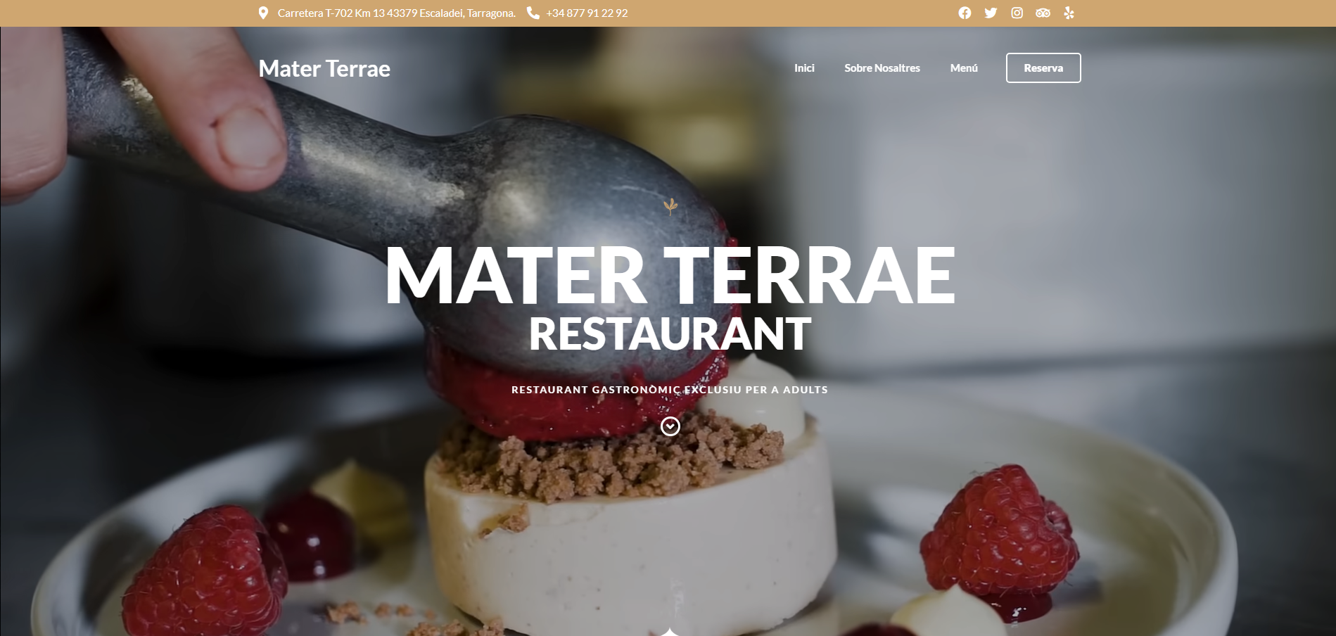
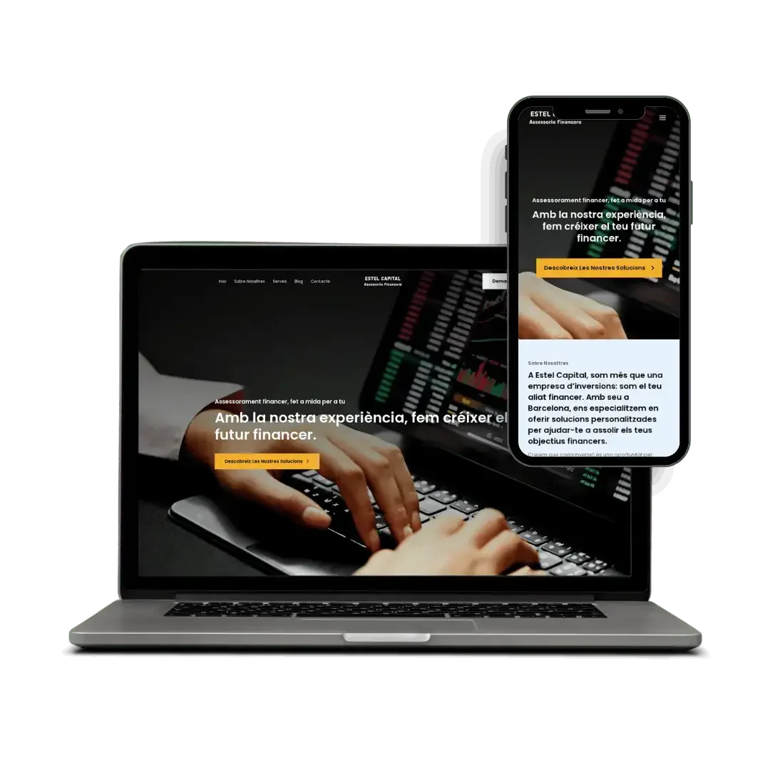
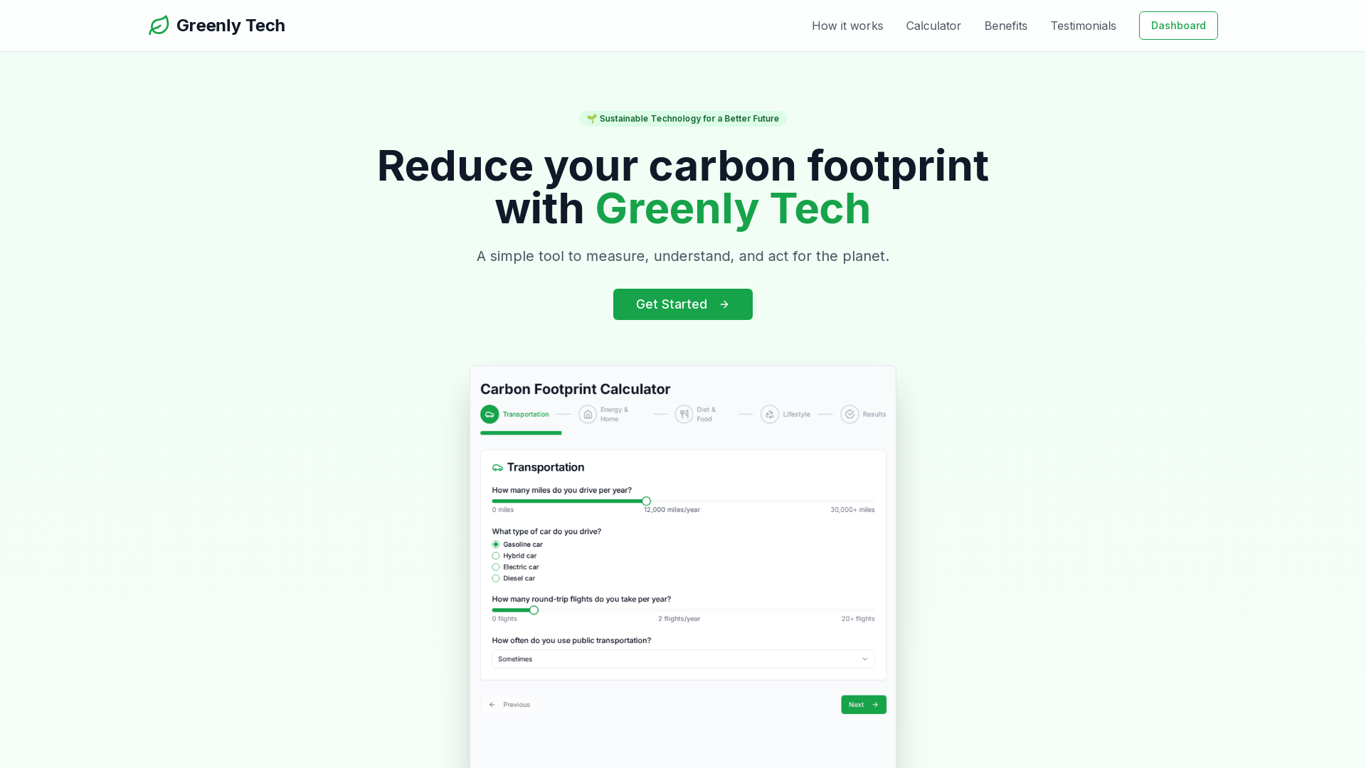
Creem webs professionals, ràpides i optimitzades amb tecnologies modernes.
Estratègies SEO per millorar el teu posicionament i visibilitat.
Google Ads, Meta Ads i funnels per generar leads i vendes.
Analitzem dades per prendre decisions basades en resultats.
Solucions d'IA per automatitzar i optimitzar processos.
Explica'ns el teu projecte. Et respondrem en un dia laborable.
/ Testimonis de clients
/ Testimonis de clients
/ Testimonis de clients
/ Testimonis de clients
/ Testimonis de clients
/ Testimonis de clients
/ Testimonis de clients
/ Testimonis de clients
/ Testimonis de clients
/ Testimonis de clients
/ Testimonis de clients
/ Testimonis de clients
L'estratègia SEO de CodiXperts ha duplicat el trànsit orgànic del nostre web en tres mesos. La millora de velocitat, el contingut optimitzat i els informes mensuals ens donen visibilitat clara del creixement digital.
Ramon
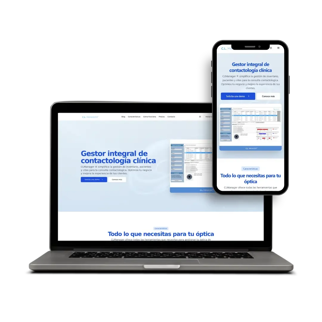
CL Managermaig de 2026Treballar amb CodiXperts ha estat clau per impulsar la meva presència digital com a escriptora. Ara tinc una web elegant, ràpida i optimitzada per cercadors que em permet connectar amb lectors i promocionar els meus llibres de manera professional.
Montserrat Espallargas
Escriptora i autora publicadagener de 2026Des que CodiXperts va optimitzar el nostre perfil de Google Business i el SEO local, hem augmentat un 50% les reserves en línia. El seu enfocament estratègic ha millorat la visibilitat local i ha captat més clients.
Joan Puig
Director de Màrqueting, Estel Capitalmarç de 2026Preus clars i un equip centrat en resultats. Comença amb una trucada curta o un missatge.
Els nostres projectes s'adapten a les necessitats úniques de cada negoci.
Els nostres projectes s'adapten a les necessitats úniques de cada negoci.
Entenem el teu negoci, objectius i necessitats. Analitzem la competència i definim l'estratègia digital adequada.
Creem la teva web professional, optimitzada per SEO i dissenyada per convertir. Desenvolupament personalitzat amb tecnologies modernes.
Llancem la web i continuem optimitzant. Apliquem SEO, analitzem resultats i millorem constantment la presència online.
Ubicació:
Barcelona, Espanya
Horari:
Dl - Dv (Obert) 09:00 - 18:00

